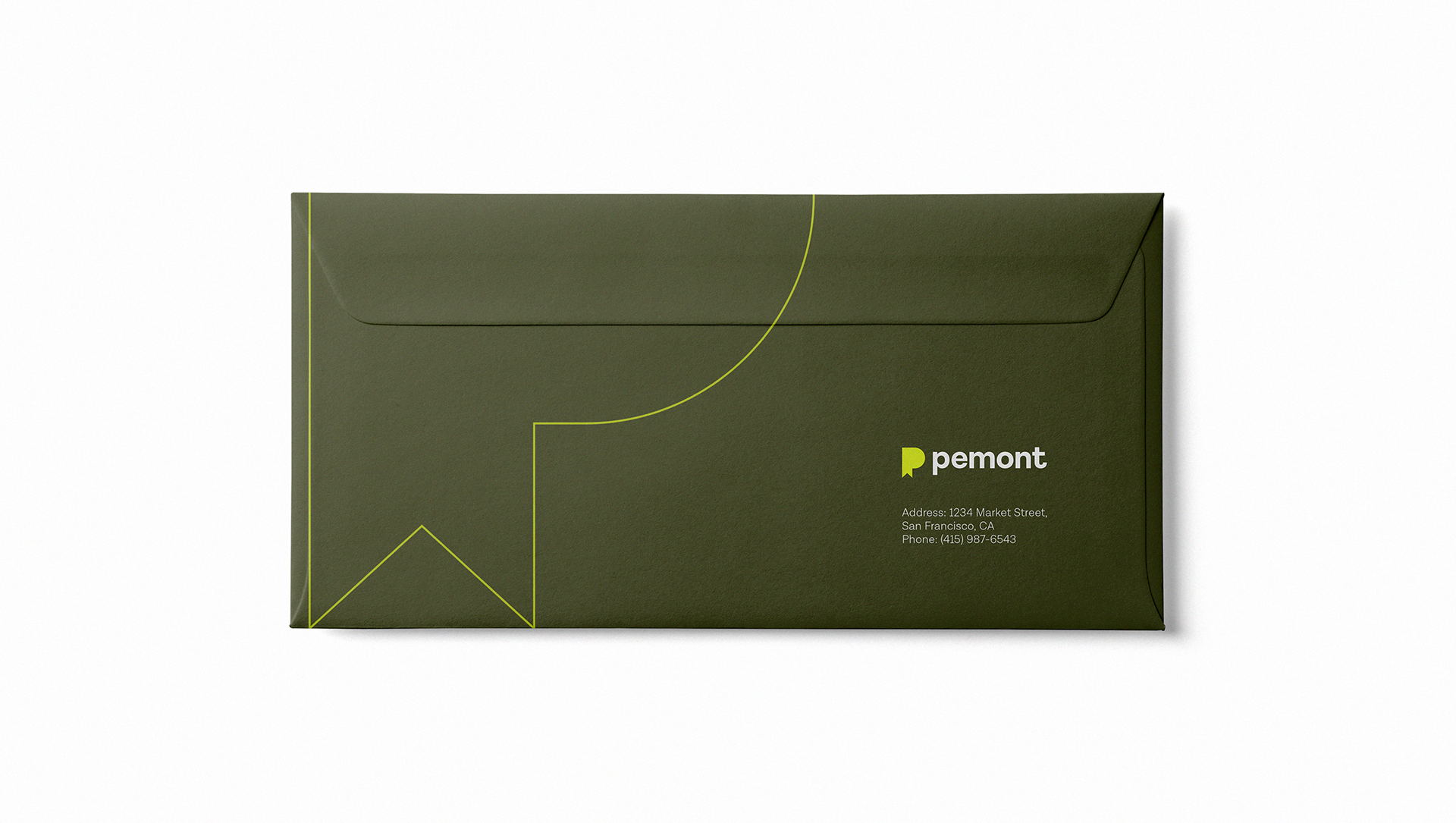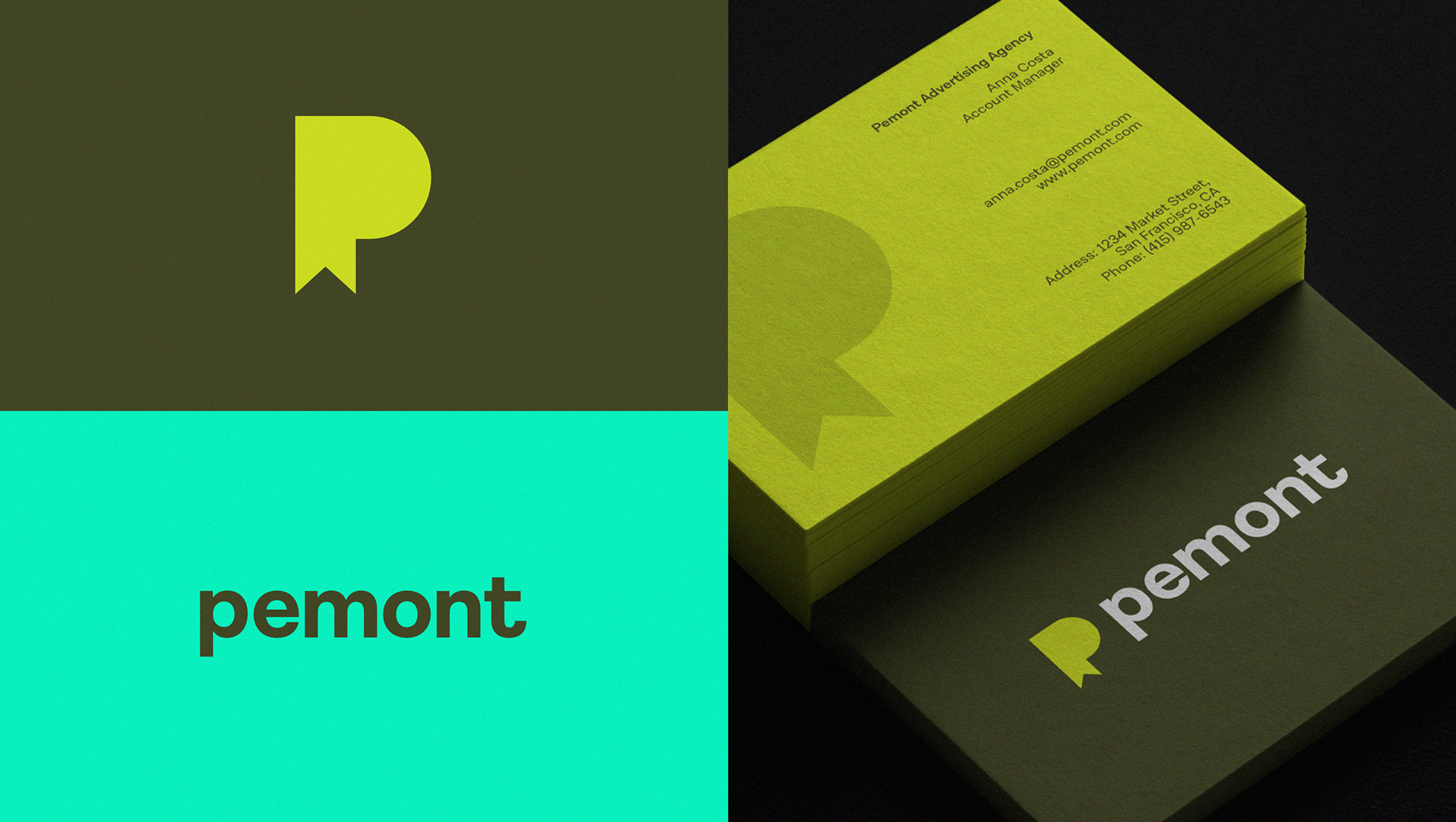

PEMONT
Pemont is an advertising agency, and we proudly present its new logo, a visual representation that encapsulates the agency's essence and mission. With an unwavering focus on creativity, Pemont's logo is inspired by the majesty of mountains, symbolizing the aspiration for height, focus, and elevated goals.
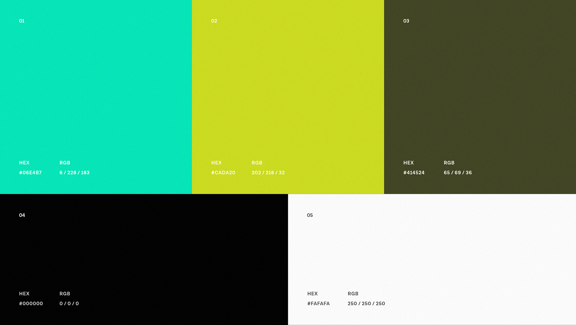
The minimalist design, characterized by clean lines and simple shapes, reflects the brand's clear and direct approach, valuing simplicity and efficiency in all advertising campaigns. Every element of the logo has been carefully thought out to convey the idea that, like a mountain, Pemont is always in pursuit of new peaks of creative excellence, guiding its clients towards success with determination and clear vision.
This new symbol visualizes our commitment to innovation and originality, while staying true to the principles of minimalism that we value. Pemont continues to stand out in the advertising landscape, elevating brands and creating impactful narratives that deeply resonate with audiences.
© Pemont 2024 | Logo & Visual Identity | Sandrin Design
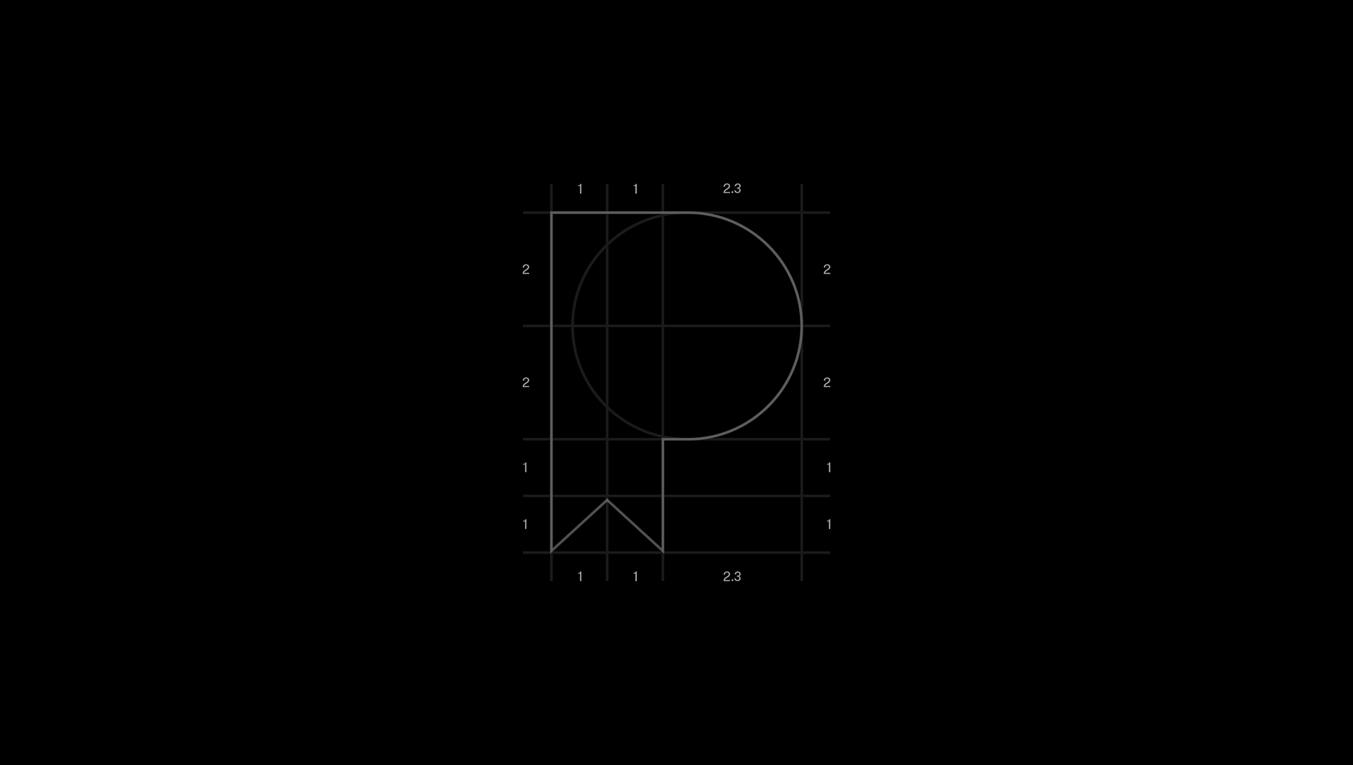

CONCEPT
The letter "P" not only represents the initial of the name Pemont but also serves as the foundation for a visually impactful and symbolic design. The innovation comes with the cut at the top of the letter "P," which forms the peak of a mountain. This element is not merely aesthetic but carries significant conceptual depth.
The mountain is a universal symbol of challenge and achievement. By incorporating the mountain peak into the design of the letter "P," we convey the message that Pemont is dedicated to overcoming obstacles and reaching new heights. It represents our ongoing journey towards progress and excellence.